
The Client
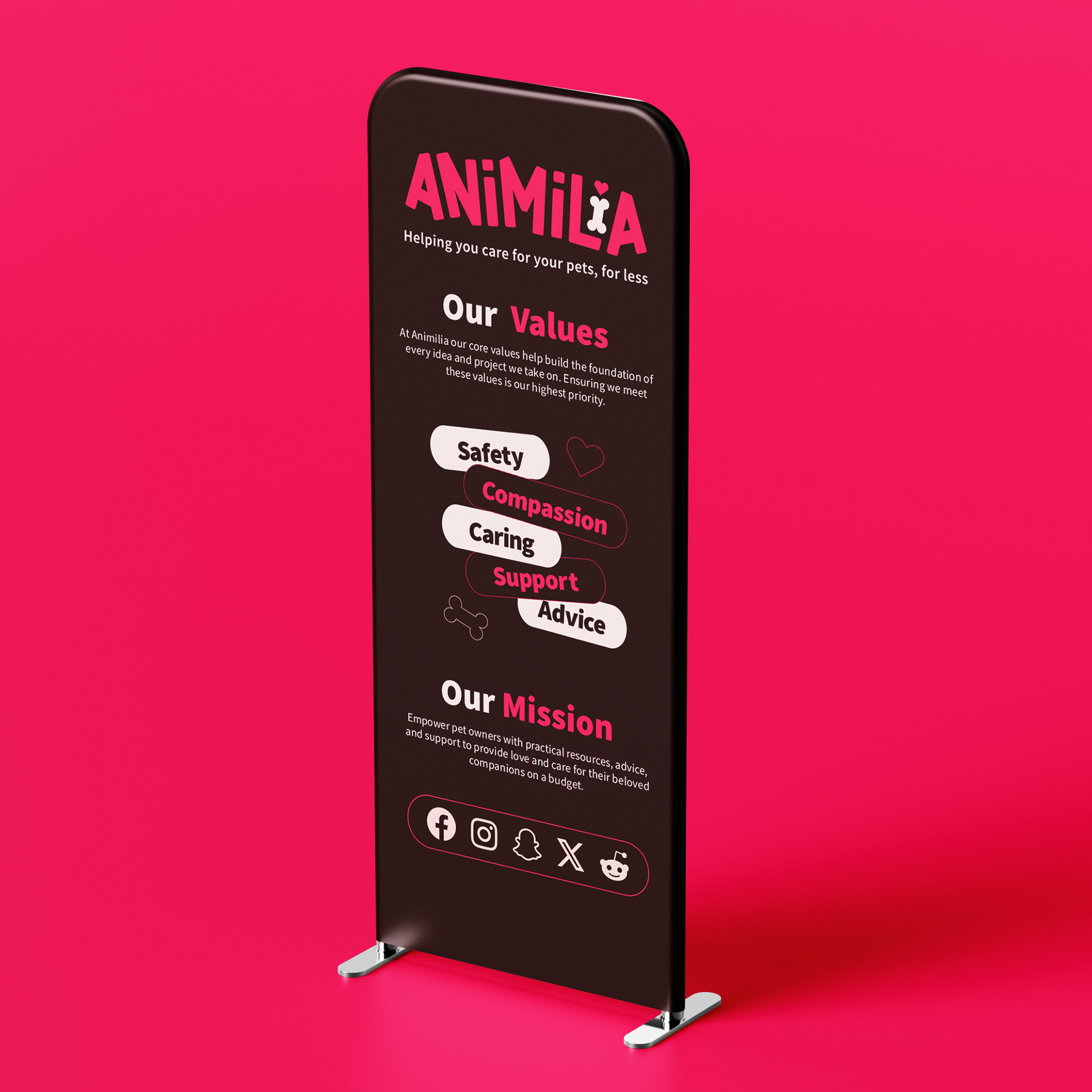
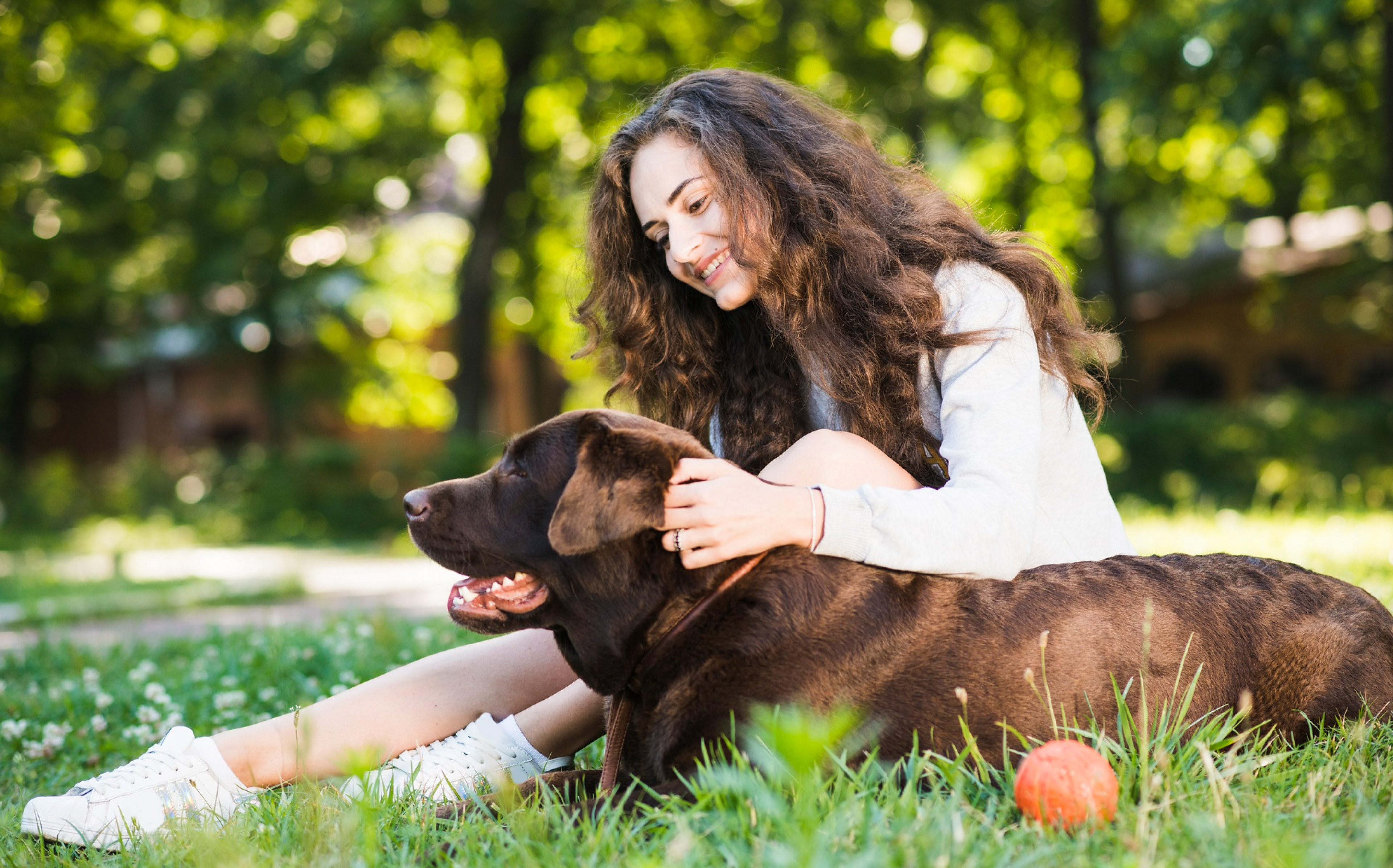
Animilia is an organisation that aims to decrease the amount of dogs being abandoned and given up to animal shelters due to the rising costs of living. To do this, Animilia provides information and gives advice on how to care for pets on a cheaper budget.
Animilia is an organisation that aims to decrease the amount of dogs being abandoned and given up to animal shelters due to the rising costs of living. To do this, Animilia provides information and gives advice on how to care for pets on a cheaper budget.
The Brief
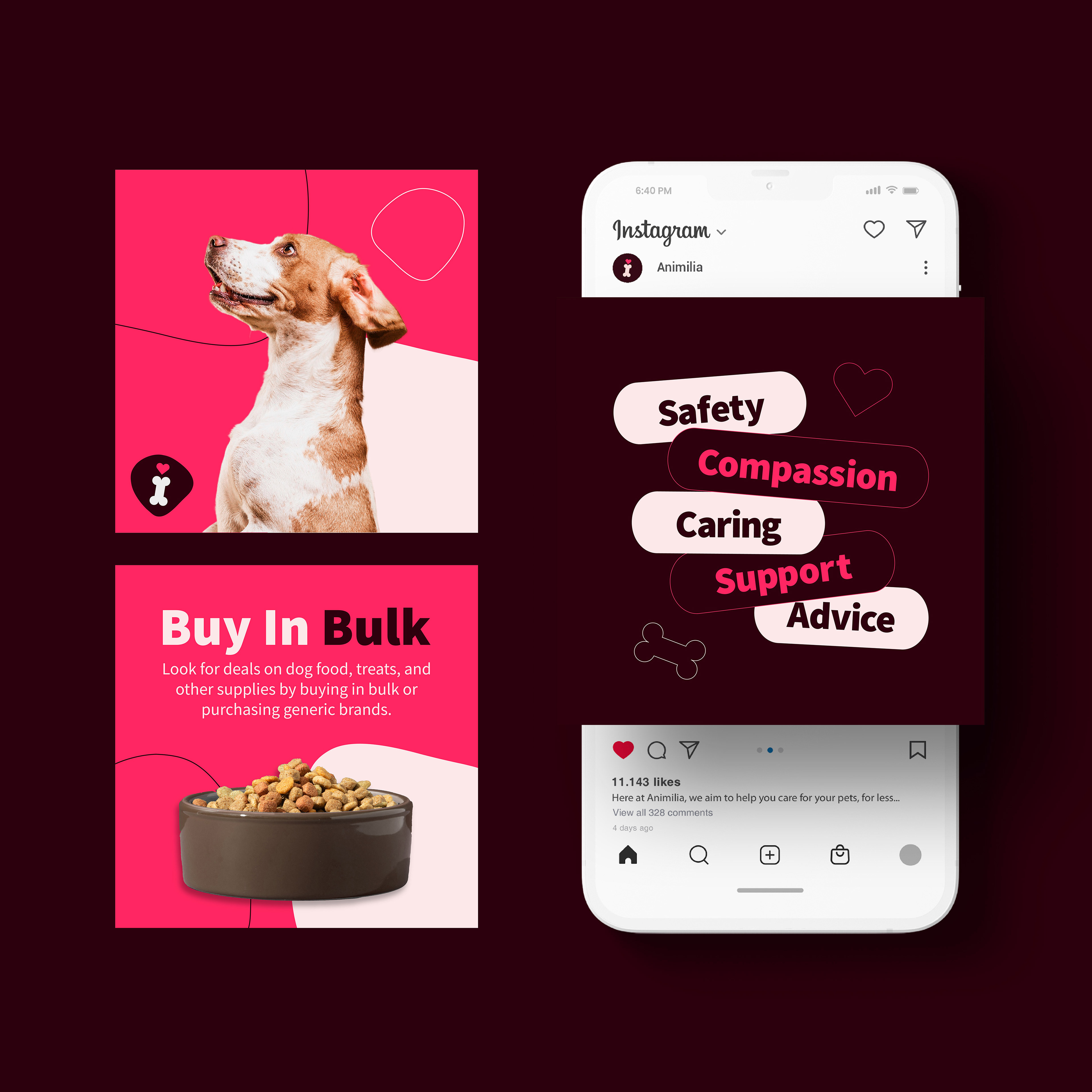
For this project I was tasked with creating a meaningful visual identity for Animilia that encourages showing compassion and care towards animals. Through the range of deliverables I produced, the goal was to decrease the amount of dogs being abandoned and encourage the audience to learn more on how they can care for their companions for less.
Deliverables
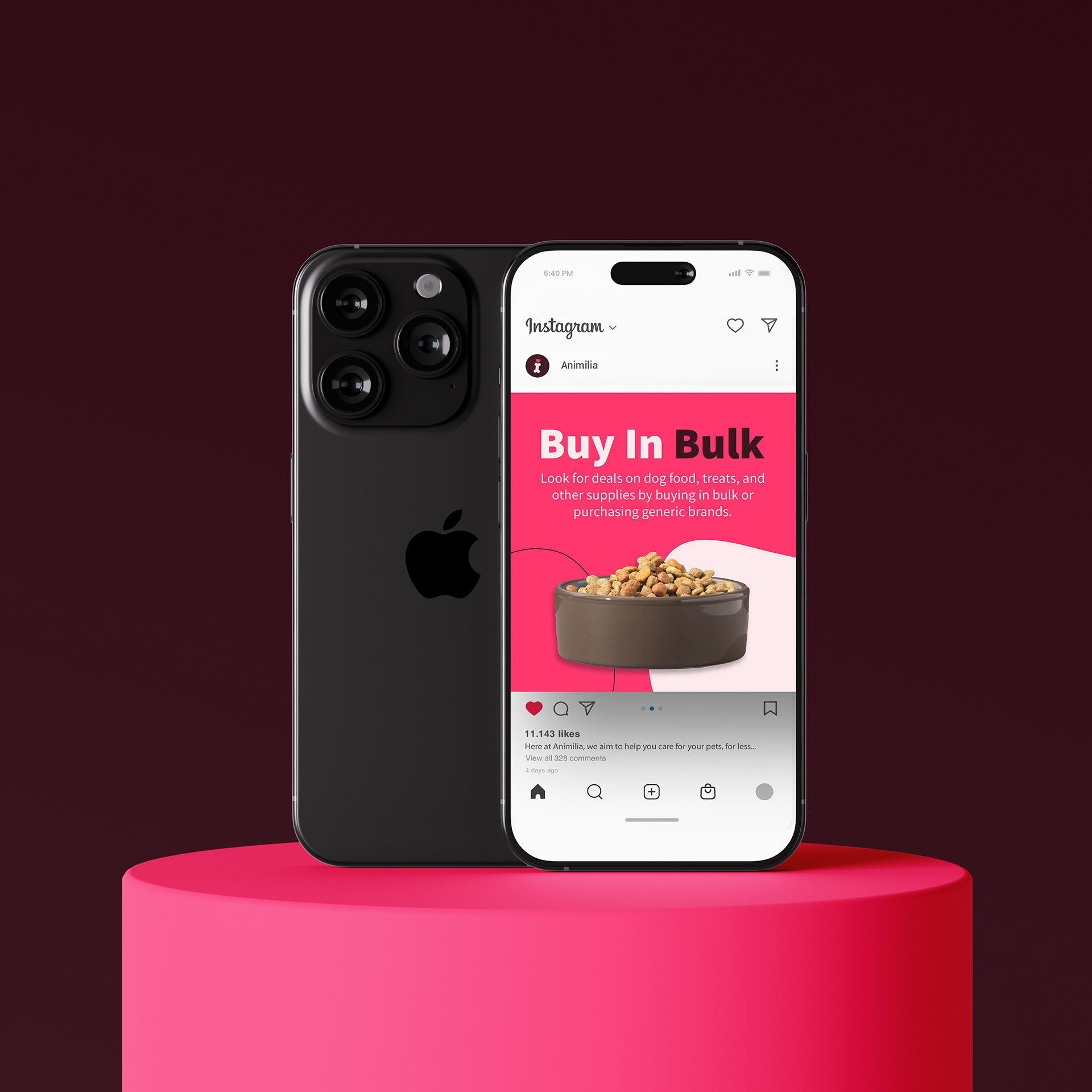
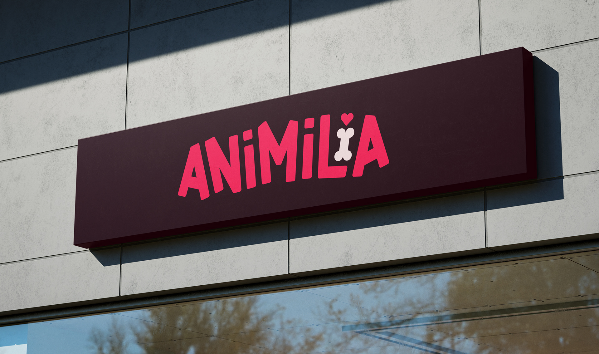
. Visual Identity
. Logo Design
. Social Media Assets
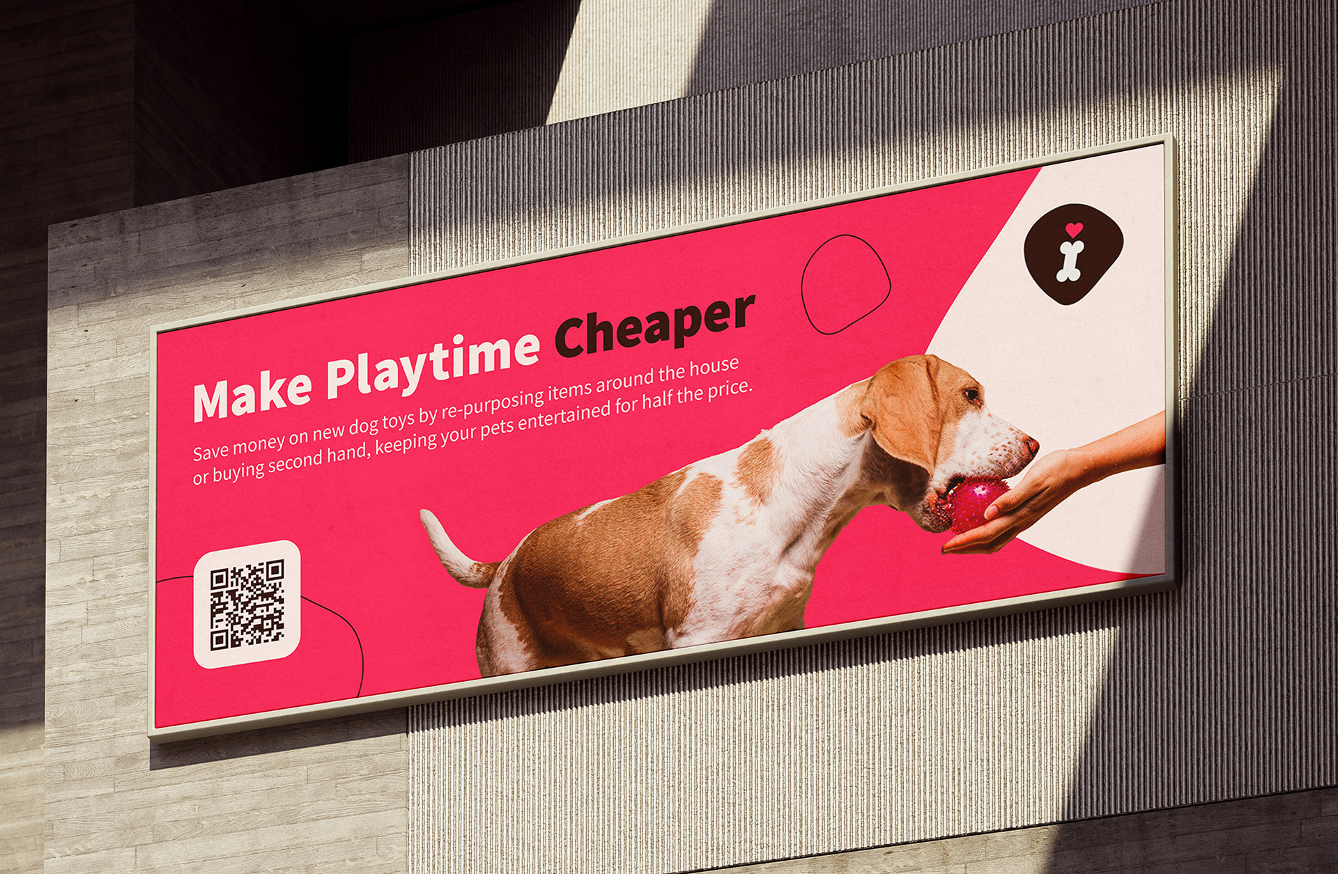
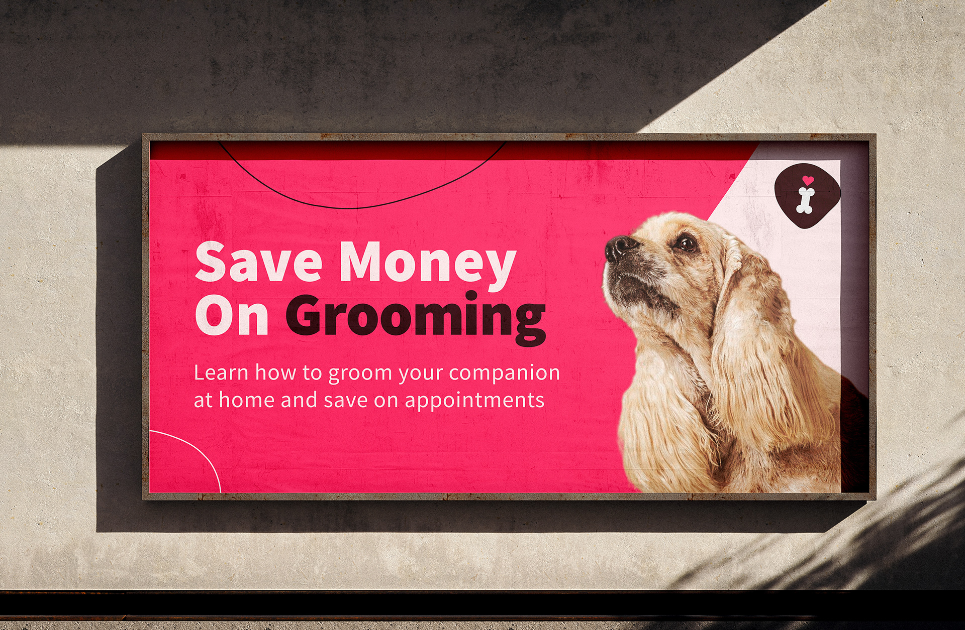
. OOH Advertising
. Tri-Fold Brochure
. Logo Design
. Social Media Assets
. OOH Advertising
. Tri-Fold Brochure